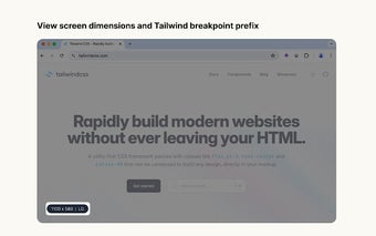
Tailwind Responsive Breakpoint Display
The Tailwind Responsive Breakpoint Display is a Chrome extension that simplifies the process of identifying screen dimensions and Tailwind breakpoint prefixes on any website. It proves to be a valuable tool for developers working with Tailwind CSS to ensure responsiveness in their user interfaces. By providing easy access to screen dimensions and breakpoint prefixes, this extension streamlines the UI development process.
Whether you are new to Tailwind CSS or a seasoned developer, having the ability to quickly reference screen dimensions and breakpoints directly on your browser can significantly enhance your workflow. With the Tailwind Responsive Breakpoint Display, you can efficiently optimize your designs for various screen sizes, making the development of responsive web applications more seamless.